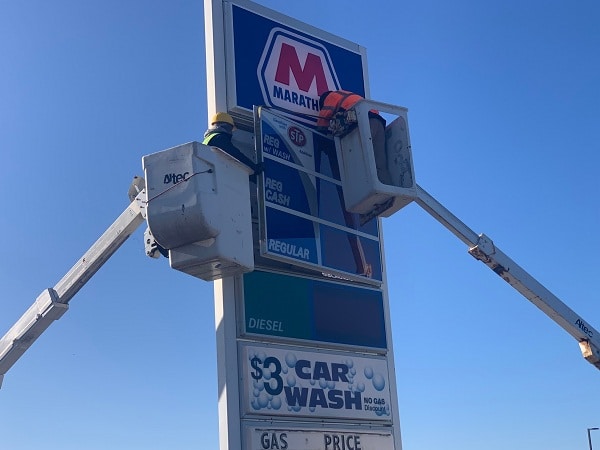
Signage is one of thesimplest ways to attract new customers or to keep the old ones engaged. Whetherthey are fun and cheeky or traditional and informative, their main advantage isthey are not perceived as aggressive as other ways of advertising.
In this article, we’ll share with you four important tips that can help you create the best signage for your business. Keep on reading to find out more about turning your signage into profit.
1. Keep it clean and simple
Formatting and design are the two things that create a first impression. If the first thing your prospects see is clutter, you’ve lost them – even if it did draw their attention at first.
Once you know you have their attention, you must make sure you deliver the best possible message for them. So what you need to do is identify the purpose of the signage. Simpler put, what do you want them to do? Maybe pay you a visit during happy hour? Or learn more about your business on your website?
Pick only one purposefor a specific piece of signage.
2. Use the same font (but differentdimensions for variety)
Reading text printedin different fonts can tire the eyes. While font provides consistency,different dimensions provide variety – and both of them are important forsuccessful signage.
According to Harrisonfrom HBR Signs “The headline should be the largest bit oftext. Whether we’re talking about a poster or a billboard, pick the mostinteresting part of your message and transform it into a headline. Then justadd the rest.”
3. Make use of intriguing images ordesign
It doesn’t have to be something shocking or improper, but you can put out there things you don’t see every day. Be it flying pigs, a cat chasing a dog or just a luxurious sports car painted in a vibrant colour – they are all appealing to our eyes.
But let’s suppose yourbrand is not that cheeky, what should you do? Just pay attention to the colourcombination. Black text on yellow background, black on white and yellow onblack are the best options, as they are easier to read.
4. Take context into consideration
If you already knowwhere your signage is going to be displayed, it can help you craft a bettermessage for your audience. Let’s say you have a natural product line that youwant to advertise on a billboard, and that billboard is placed next to a river.Including a reference of that river in your ad has a higher chance to draw yourpotential customers’ interest. This happens because the ad will be perceived aspart of something bigger, and not an isolated self-centered message.
Bonus: 5. Do not include too many details
Although this fallswithin “keep it clean” range, it deserves a special mention. Details are to begiven in the actual sale. The main purpose of signage is to inform yourpotential customers about an offer, a service or a product you’re handing out,and to maintain a certain level of curiosity.
The more details yougive, the less likely people are to contact you. After all, they got all theinformation they needed to make a decision just by reading the signage. And inmost cases, that decision is to take no further action.

